Designed to Inspire: Pairing Sinks with 2020 Color Trends
Sinkology is proud to present Kristan Allen, our design expert and guest blogger who runs the @FarmhouseRedefined Instagram. Kristan is here to share some design ideas and inspiration around designing your home around your Sinkology sink.
______________________________________________________________________________
Spring and summer typically bring an onslaught of predictions for what will be big in home design for the upcoming year. And if you’re anything like me, you relish reading up on all the trends and exciting new things on the horizon! One thing I can never get enough of? Color palette predictions! I love to see what hues rise to the top and brainstorming how I can bring these pops of color into my own home
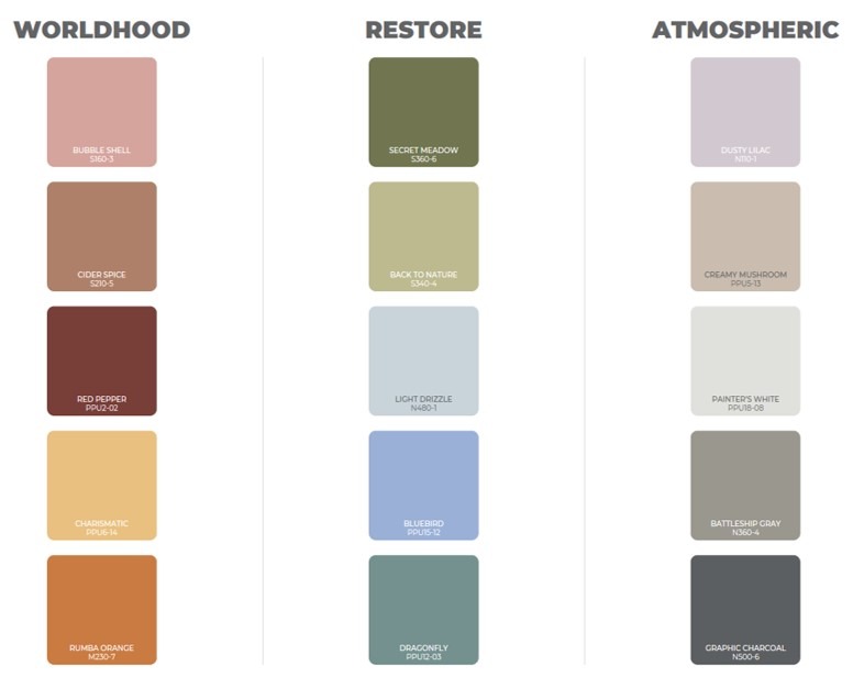
Behr recently shared its 2020 color predictions and I love how they broke it up into three beautifully grounded palettes: Worldhood, Restore and Atmospheric. Each one is a dichotomy of color that spans warm, cool and neutral…ummm yes, sign me up! While my mind immediately started scheming of ways to work these colors into my home, I also noticed how each palette would match beautifully with Sinkology’s collection of kitchen sinks – did you know they offer sinks in three different materials now?! Take a look below for my take on pairing Sinkology sinks with these Behr color predictions for next year.
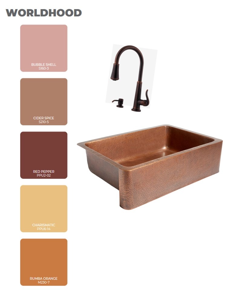
Rustic, Earthy and Warm
Behr’s Worldhood palette is made up of a variety of warm shades that range from tan and pink to ochre and russet red. The spicy warmth makes copper a natural partner in my mind! The burnished, textured tones of Sinkology’s Adams Farmhouse Sink would pair beautifully with any of these shades. As part of the All-In-One Kit, Pfister’s Ashfield Pull-Down Faucet in Rustic Bronze complements the sink and these style-forward colors, which could be brought in as accents (think canisters and tea towels) or focal points (Red Pepper or Cider Spice cabinets, anyone?).
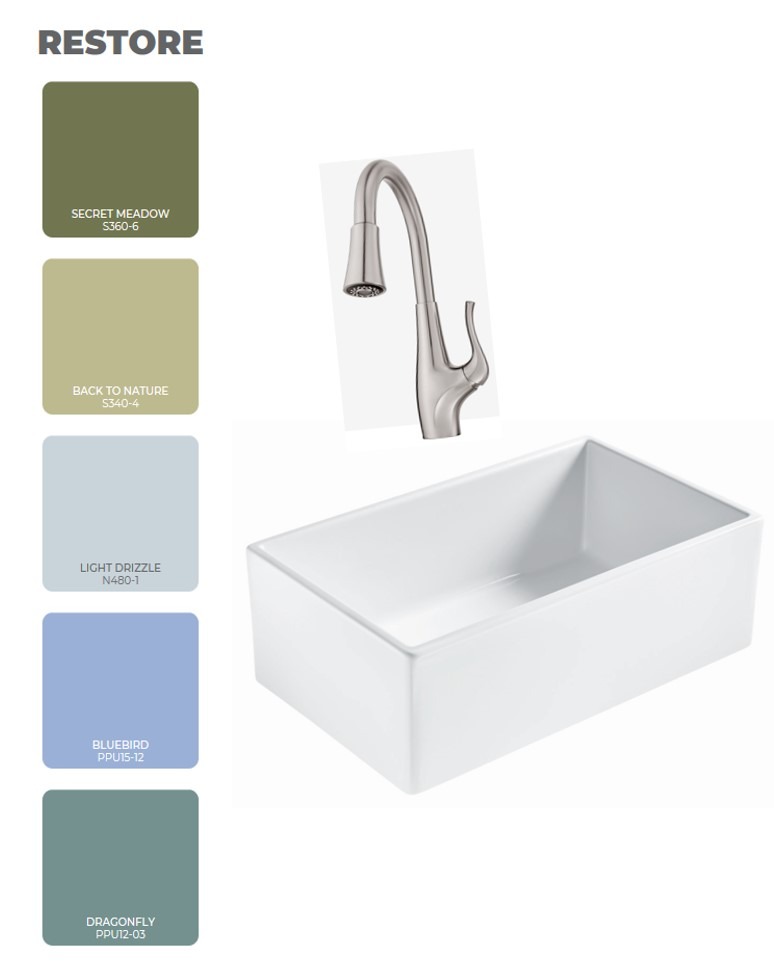
Cool, Calm and Breezy The Restore palette reminds me of all nature’s coolest and calmest hues – mossy greens, teals and light blues. Definitely relaxing and peaceful! The clean simplicity of these colors makes crisp white a perfect complement. Sinkology’s Fireclay line of sinks, which includes the Bradstreet II, is so versatile when it comes to design. The clean lines, white color and durability make these sinks a great choice for any type of kitchen – whether you’re meal prepping for 1 or 12! In thinking about this sink/color palette combo, you can keep things stylish and classic with a stainless steel faucet like Pfister’s Clarify Pull-Down.
Neutral, Light and Ethereal
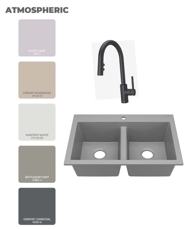
Most of the colors in the Atmospheric palette are what I would consider core neutrals – but I love that Behr threw in a pale lavender color for some fun! This neutral palette would be at home anywhere and that’s how I feel about Sinkology’s granite sinks. They come in three different colors and their natural materials make them both durable and beautiful. The Whitney in Graphite Gray is a great way to channel uniformity within this color scheme. It’s a great middle ground for the lighter and darker neutrals, and with a matte black faucet like Pfister’s Stellen Pull-Down, it’s a match made in monochromatic heaven!
What colors are you loving as we move through this year and into next? Do your tastes tend to change as seasons and years fly by or are you pretty consistent in what you love? I have my staple likes that stay pretty constant…but I’m always looking for ways to change things up through color and pattern. Happy Styling, Friends!
_____________________________________________________________________
If you have any additional questions during your search for the perfect copper, fireclay farmhouse sink or granite sink, our Sinkologists are here to help. Contact us or follow us on Facebook, Houzz, Pinterest, or Instagram for more helpful tips and design ideas.