Before & After: The Blonde Vic Kitchen Reveal
Stunning Victorian Home Renovation
Our friends Catherine & Bryan over @beginninginthemiddle recently completed a kitchen renovation in their 100 year old Victorian home. They installed a Sinkology fireclay sink & shared with us the details of their renovation.
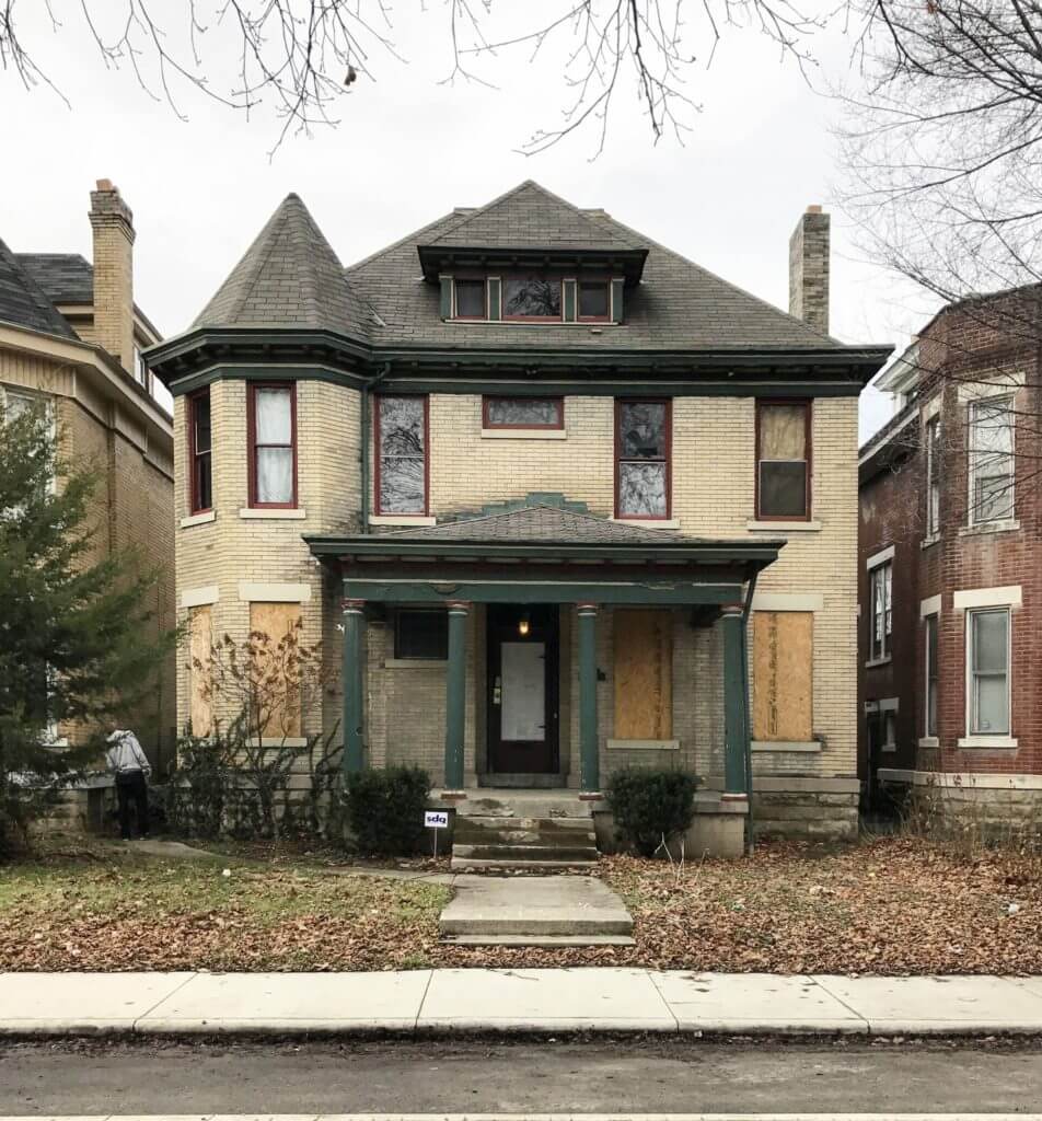
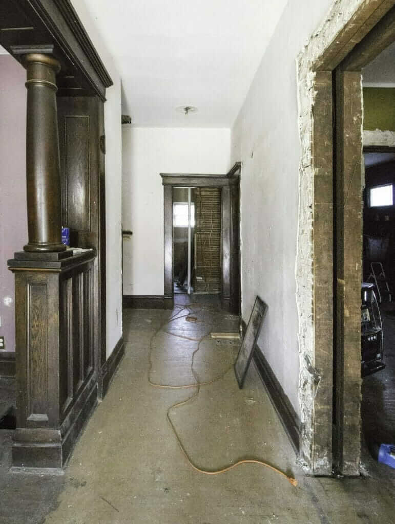
Today is an exciting day!! After over two years of renovations, we’re revealing the first room at The Blonde Vic: THE KITCHEN! If you’re new here and don’t know about this project, we’ll fill you in. In 2017, Bryan & I bought the Vic. We planned to make it a vacation rental for our brand, The Village Host.It’s a 3,000 sq. ft Victorian. It was built over 100 years ago. This is what it looked like during our first walkthrough.
We gutted & renovated the entire thing, from the roof all the way down to the basement. Despite the extensive renovation, we didn’t want it to feel new. We aimed to preserve the original elements and add back as much character as possible.
In 2018, we found out we were having a baby and at the last minute, and decided to move in instead of renting it out. Now that we’re living here, we’re adding finishing touches little by little to the interior & hope to tackle the exterior later this year. We’ve been documenting our design & reno progress on the blog here and on IG here in case you’d like to take a peak! Over the next few months, we’ll begin revealing one room at a time and can’t wait to show it all to you!
Now onto the kitchen reveal… grab a cup of coffee and get comfy, folks – this is a long one!
Our Partners in The Blonde Vic Kitchen Renovation
Before we get into the thick of it, we want to say a giant thank you to our brand partners on this kitchen who were so wonderful to work with. We love & use these brands on other renovations, and were thankful they said yes to being a part of our own kitchen at The Vic. Semihandmade, Emtek, Sinkology, A Carpenter’s Son, CS Hardware, McGee & Co, and Delta – we’re talkin to you.
The Blonde Vic Kitchen Design Process
Bryan & I went through about 27 different options for the kitchen, trying to take into account all of the important factors in kitchen design. Traffic flow, maximizing storage & functionality, minimizing clutter, and of course… aesthetics. From the beginning, we knew we wanted to go dark in the kitchen, but the design definitely evolved from when we started planning to the end result. You can catch up on all of our different design changes here & see our final design here. The biggest wish list items we knew we needed to incorporate were:
- Add a bathroom to the first floor
- Enlarge kitchen while retaining as much of the original floorplan as possible
- Retain a traditional dining room; create comfortable living room
- Integrate kitchen finishes with the rest of the home & make it feel like another living space (modern/traditional/vintage-inspired)
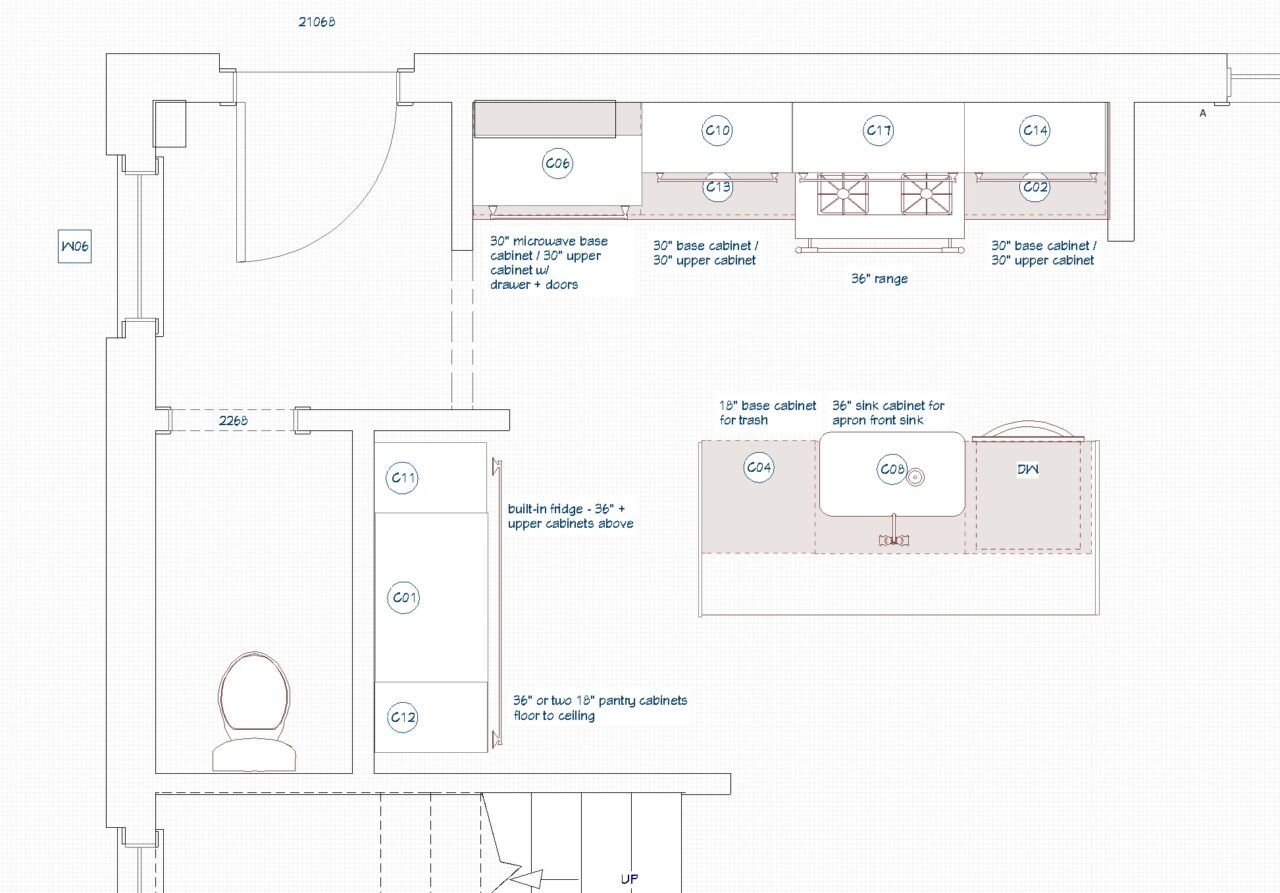
With all that in mind, our final floorplan ended up looking like this (we kept all of the walls as-is outside of the kitchen):
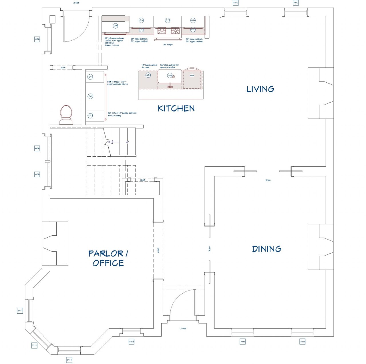
Here’s a closer look at the kitchen.
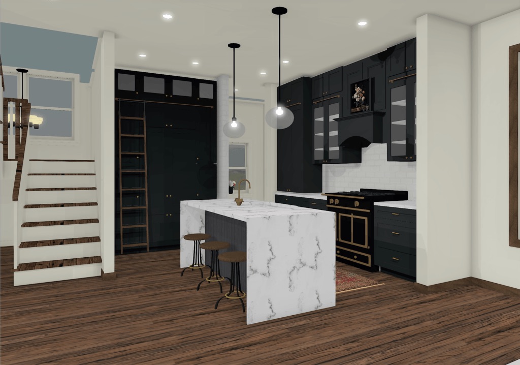
And here’s a screenshot of our final rendering.
The Blonde Vic Kitchen Reno Journey
This is what the view from the front door of The Vic used to look like, before (left) & after (right) demo. The kitchen is straight ahead.
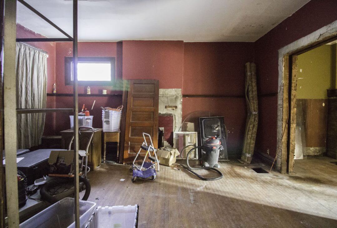
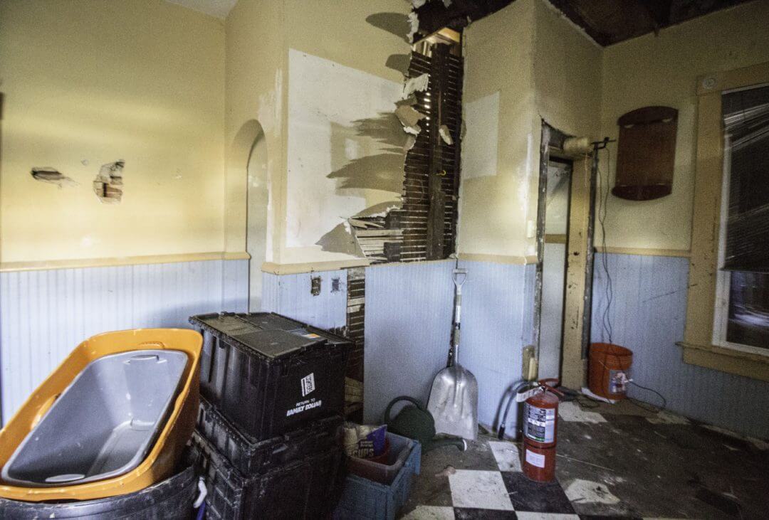
Getting a little closer, this was the old kitchen space in all of its messy glory. (psst, you can find the rest of the first floor before tour here).
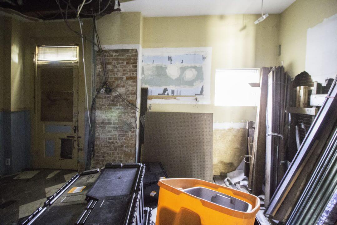
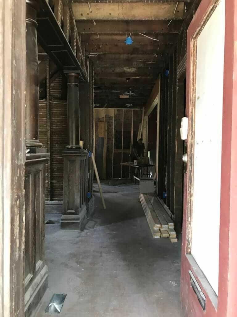
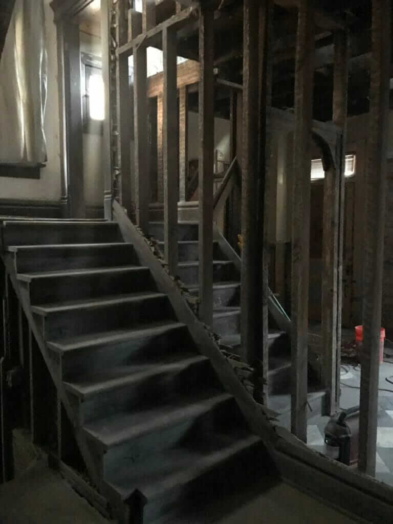
And this is what the kitchen space looked like after demo. I almost forgot how bad it was!!
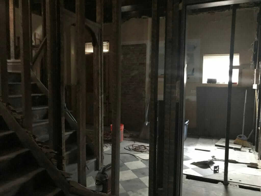
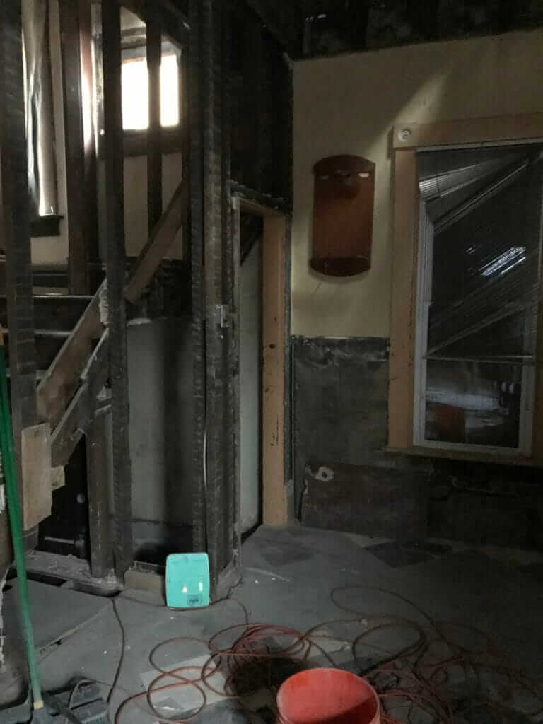
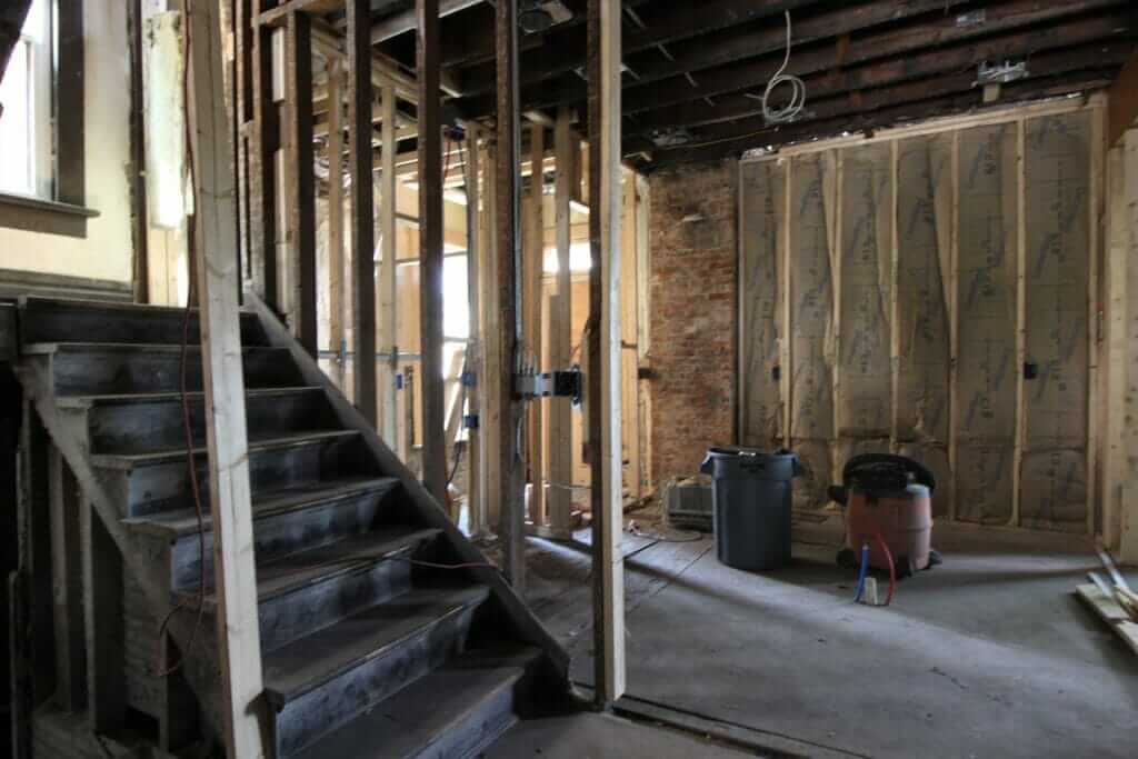
There were two staircases in the house. The one inside the kitchen walls was likely a servants’ staircase that allowed them to come directly into the kitchen without entering the main area. The odd thing about it is that it just led to the same landing as the main staircase — it didn’t go any farther than that like servants’ staircases typically do. Weird, right?
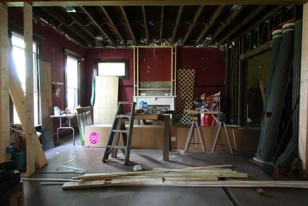
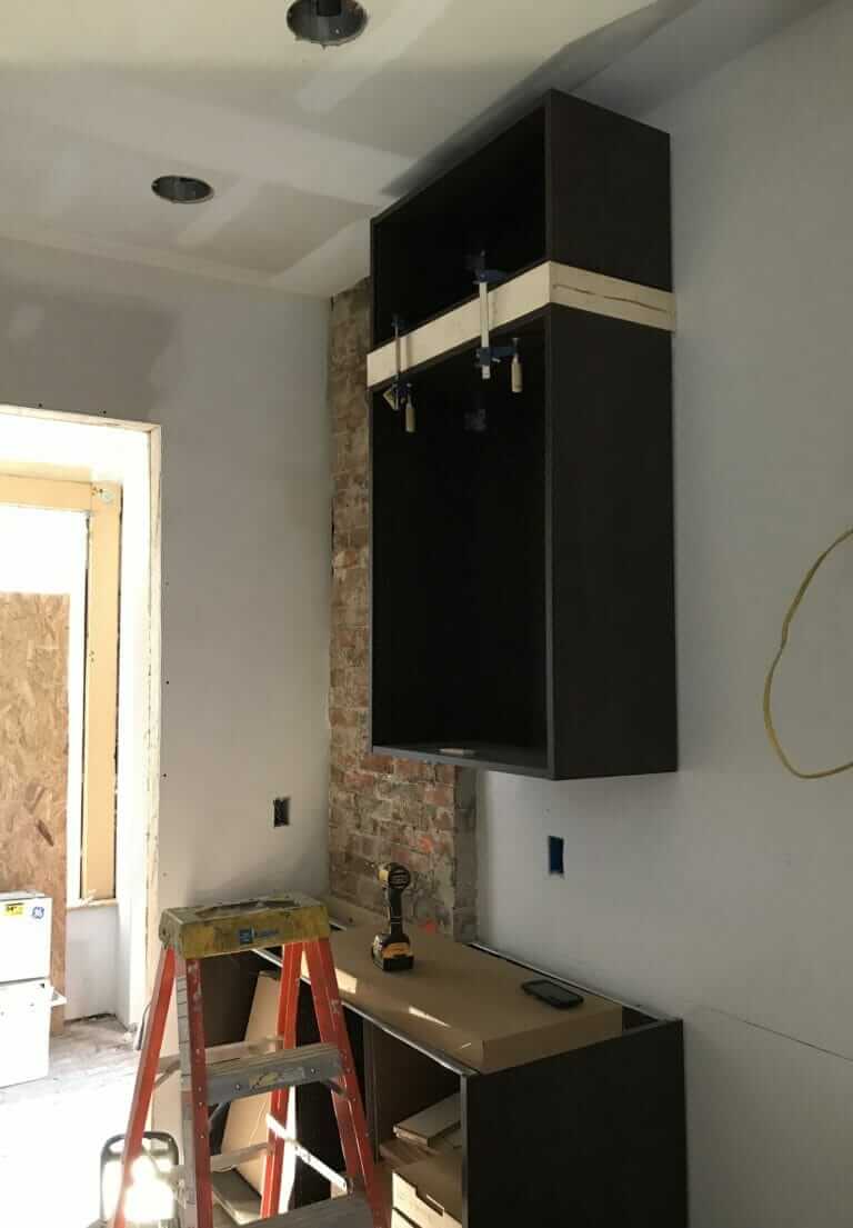
This was the view after framing, insulation, and electrical rough-in…
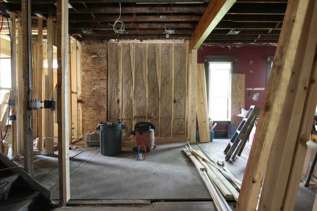
And after drywall, flooring, and cabinet frames started going in. Typically, we save cabinet install for last, but in this case, we had to do things out of order because of painting & flooring delays.
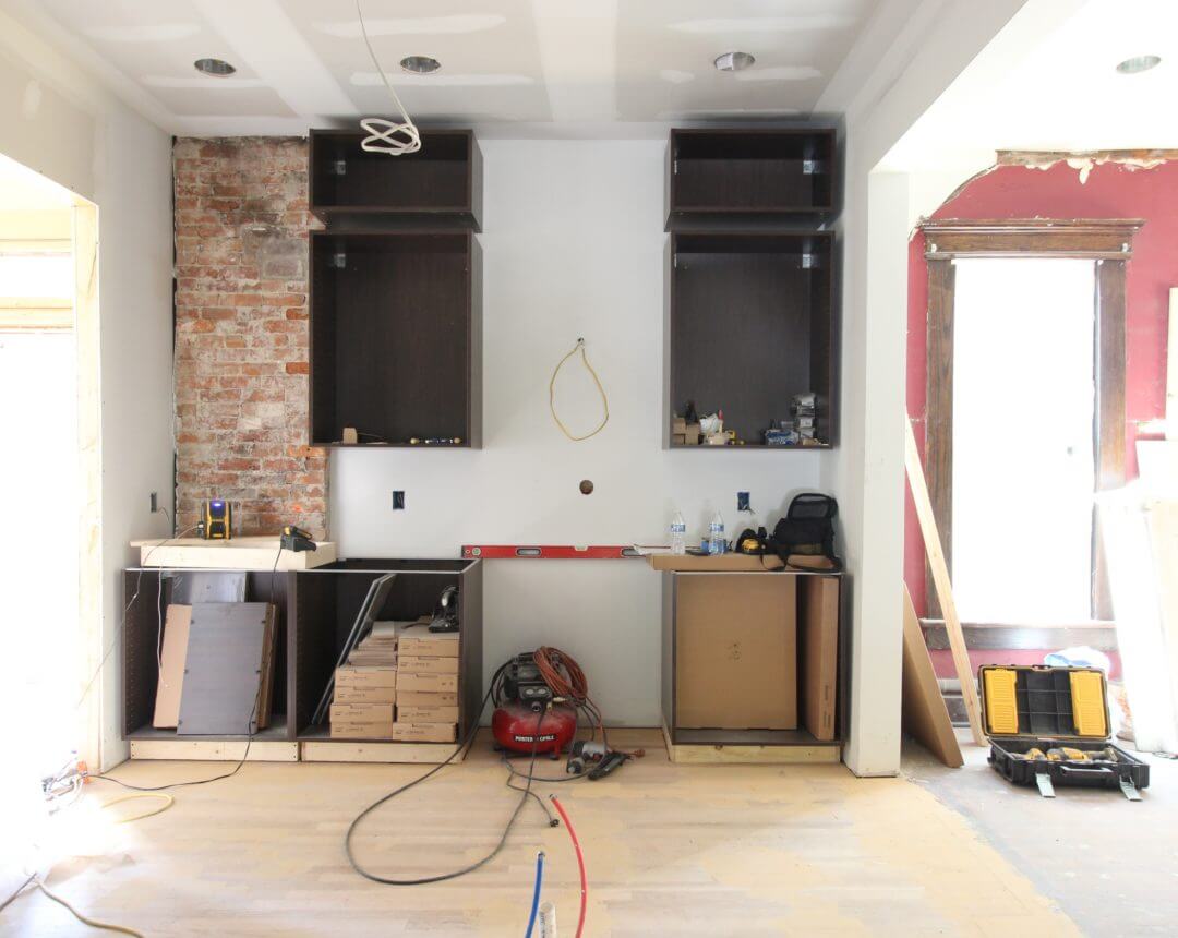
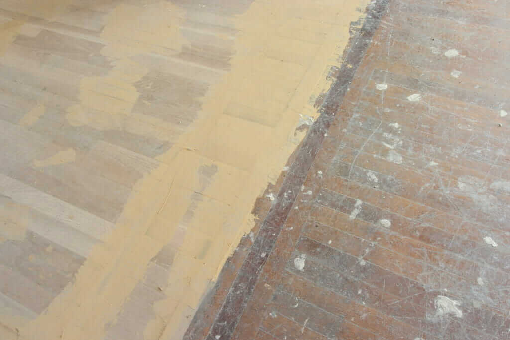
Speaking of flooring… our flooring guy installed new red oak hardwood floors in the kitchen to match the rest of the 1st floor, and then refinished all of the floors at the same time. It really makes the kitchen feel like it’s always been that way!
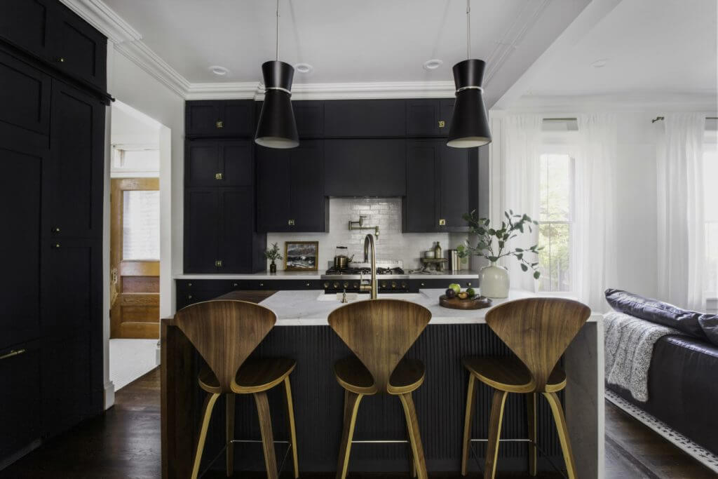
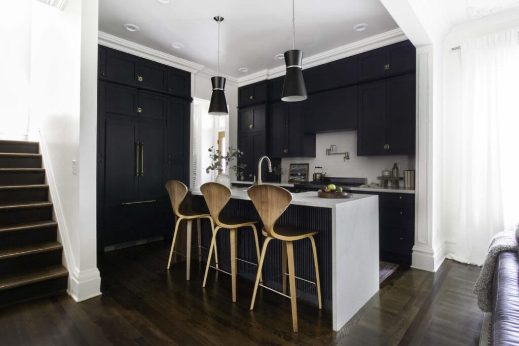
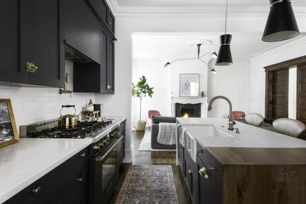
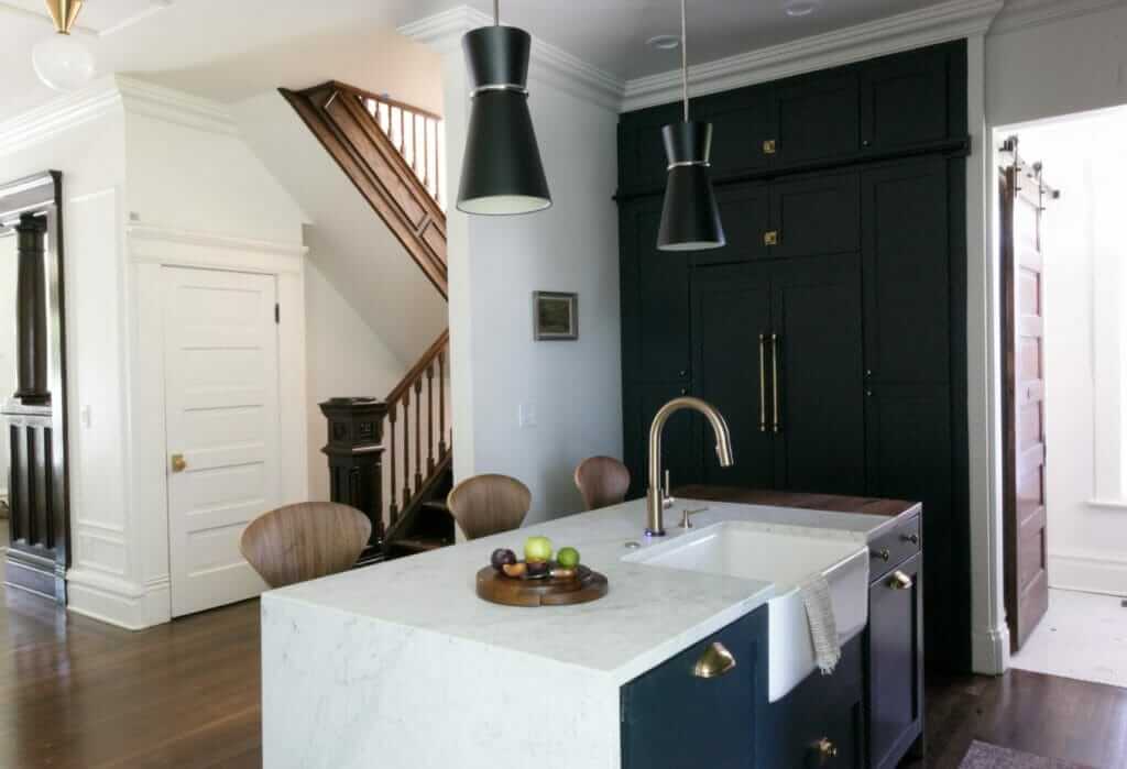
The Blonde Vic Kitchen After Renovation
Hereeeee it is now!
By removing the second staircase in the kitchen, we were able to make room for another wall of cabinets on the left & a powder room behind them.
Overcoming Design Challenges in The Blonde Vic Kitchen
It was a tough decision, but we had to do it considering the limited space we were working with.
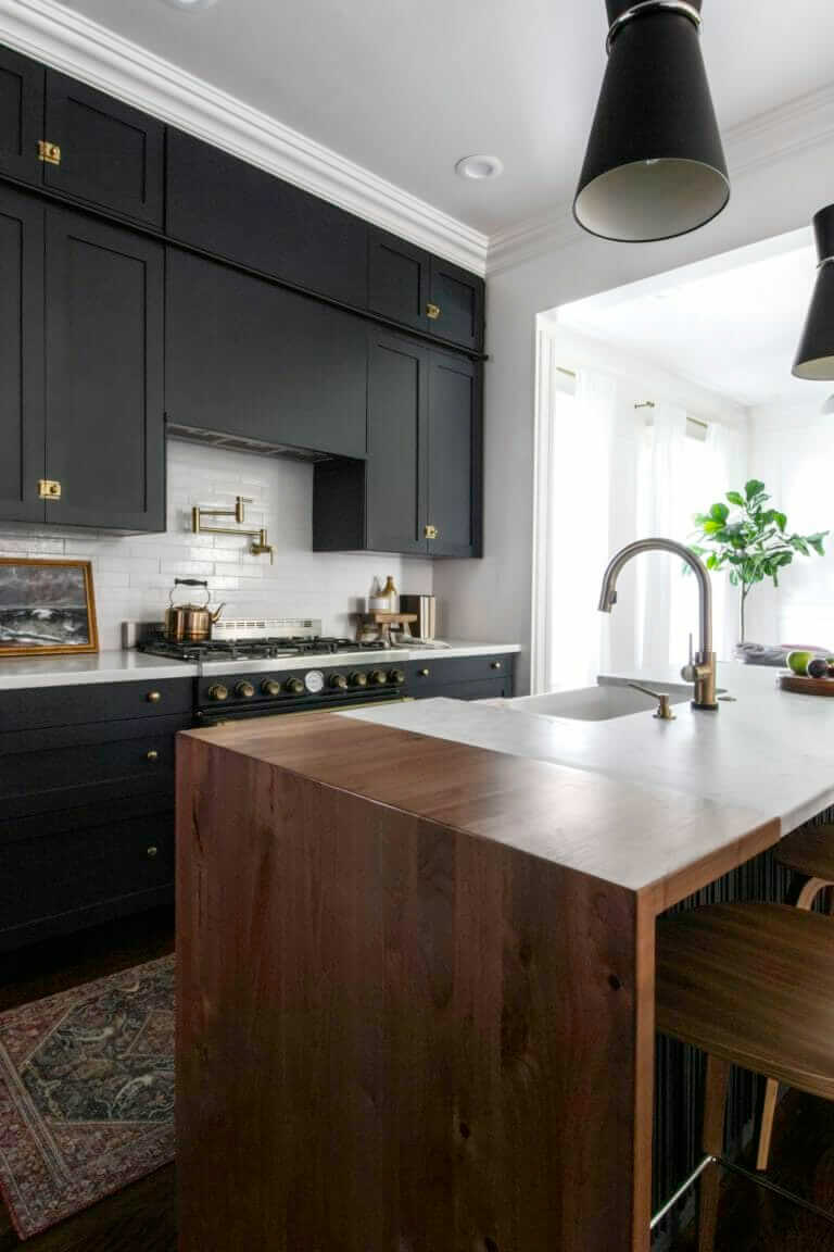
This is the first time we took out a wall in an old home, and I’m so glad we did. The kitchen itself isn’t big (it’s about 12′ x 12′) but having the wall open into the living space makes it feel twice as big.
This is what that same view looked like when we bought the house.
And again, as construction progressed.
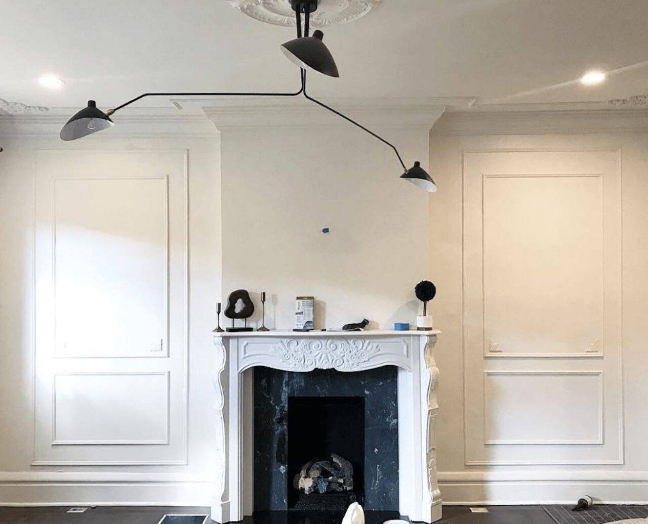
And then after we got new drywall up, Metrie molding, our new mantel & lighting installed.
Integrating the Living and Kitchen Space in The Blonde Vic
Here’s the view from the coffee bar looking into the living room & dining room. I really love this view ♥️ Usually we have a TV above the fireplace but swapped it out for these photos. We’ll likely invest in The Frame TV so we can have a blend of TV + art.
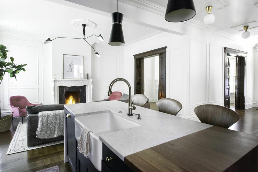
I love that we can be sitting at the island or cooking and see the fireplace — it adds a coziness factor to the kitchen that goes a long way.
DIY Elements in The Blonde Vic Kitchen
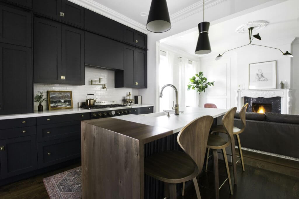
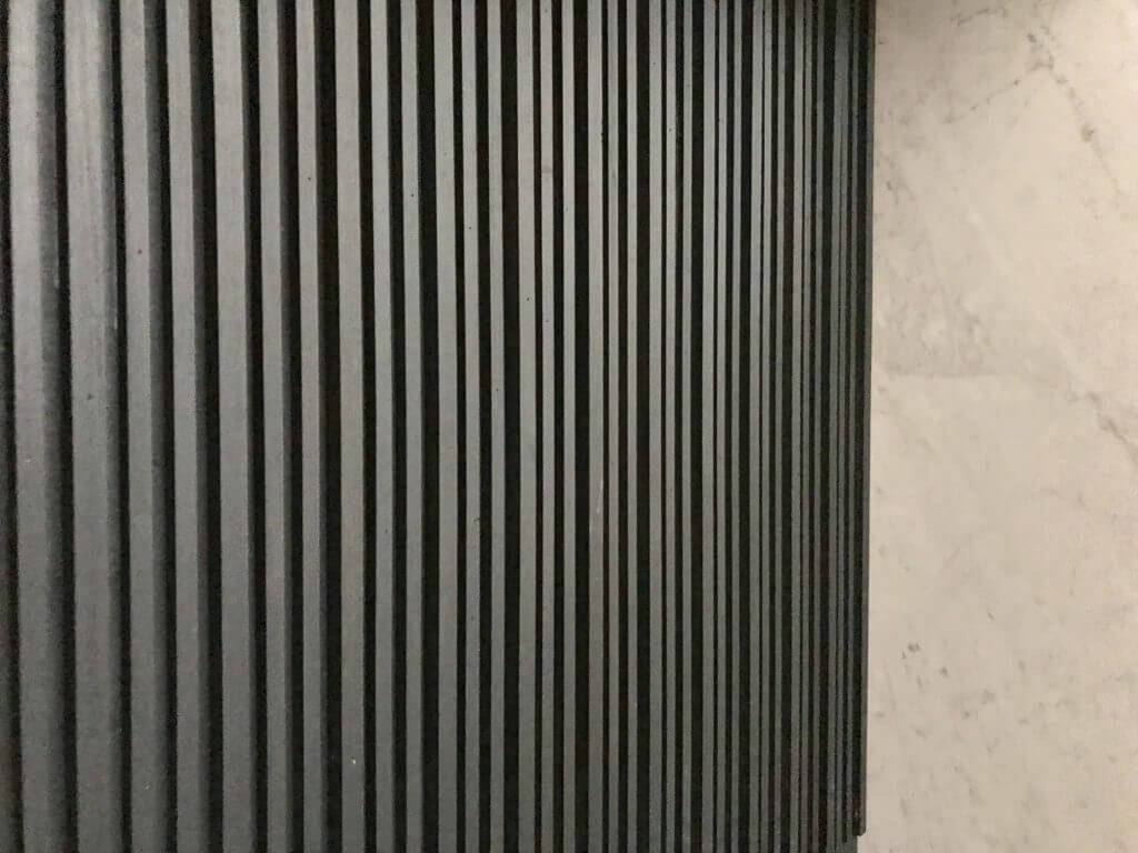
The front of the island was a DIY that evolved over time. We loved the look of fluted wood, but didn’t have the budget to get something made custom, so we mimicked the look by installing small wooden dowels close together. We’ll add a brass strip at the bottom to finish it off (one of these days, ha!) but for now we’re super happy with how it came out.
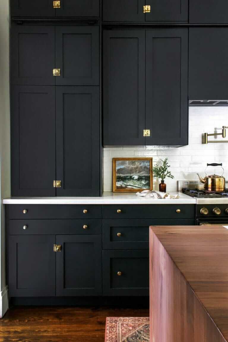
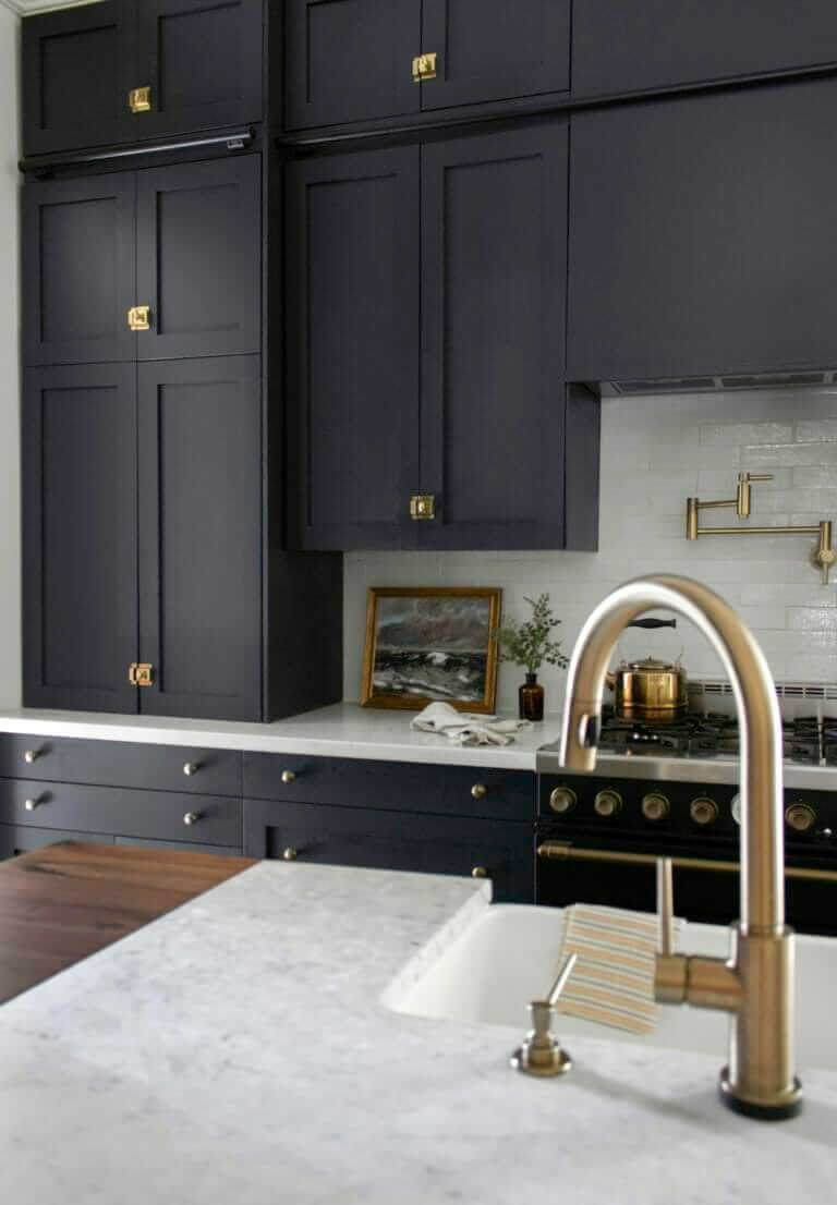
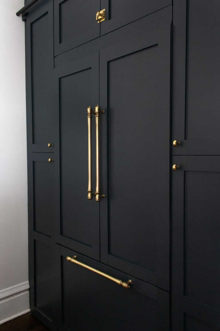
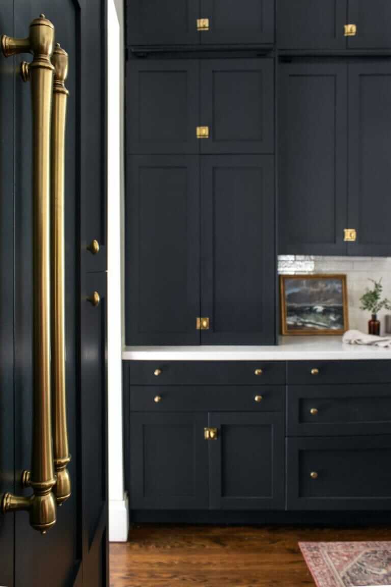
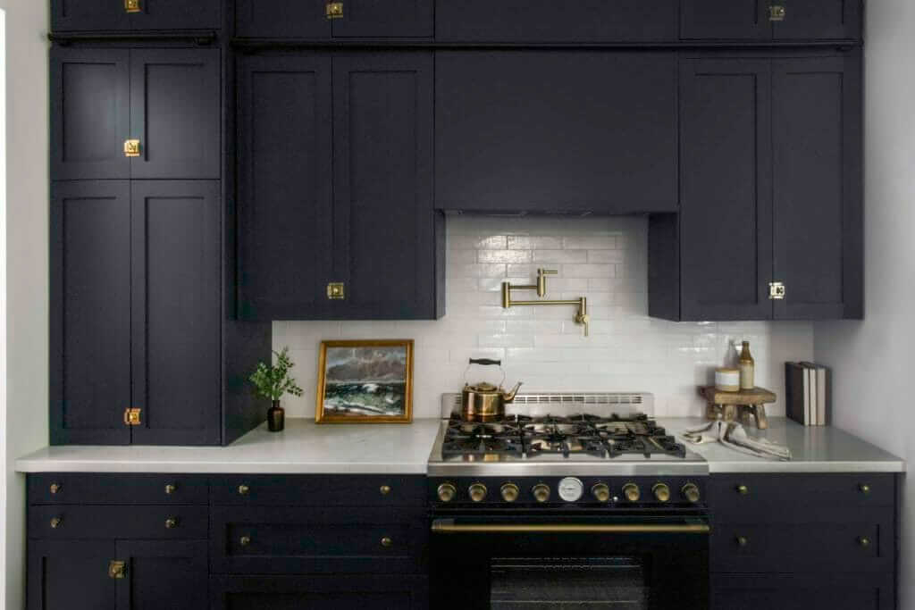
On cabinets, we partnered with Semihandmade on this kitchen. They make custom doors that fit on IKEA frames, which allows you to combine the functionality of IKEA cabinetry with a big variety of doors & drawer fronts. We love, love, love them (and so do our clients)! We opted for the DIY Shaker line of doors, which come unfinished & can be painted whatever color you’d like. After searching for the perfect black/green/blue/grey, we landed on Behr Black Sable. It changes colors in different light, and it feels sophisticated & moody without being too harsh.
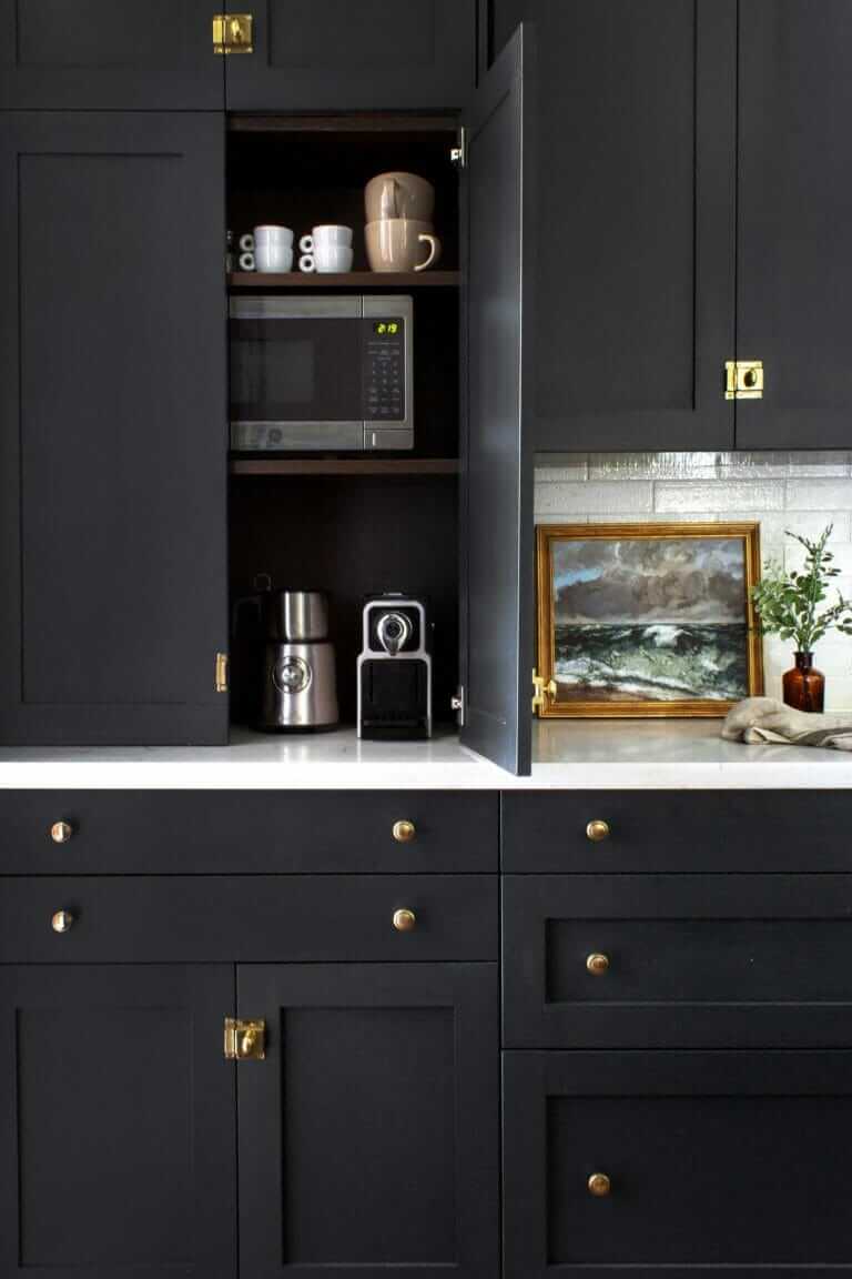
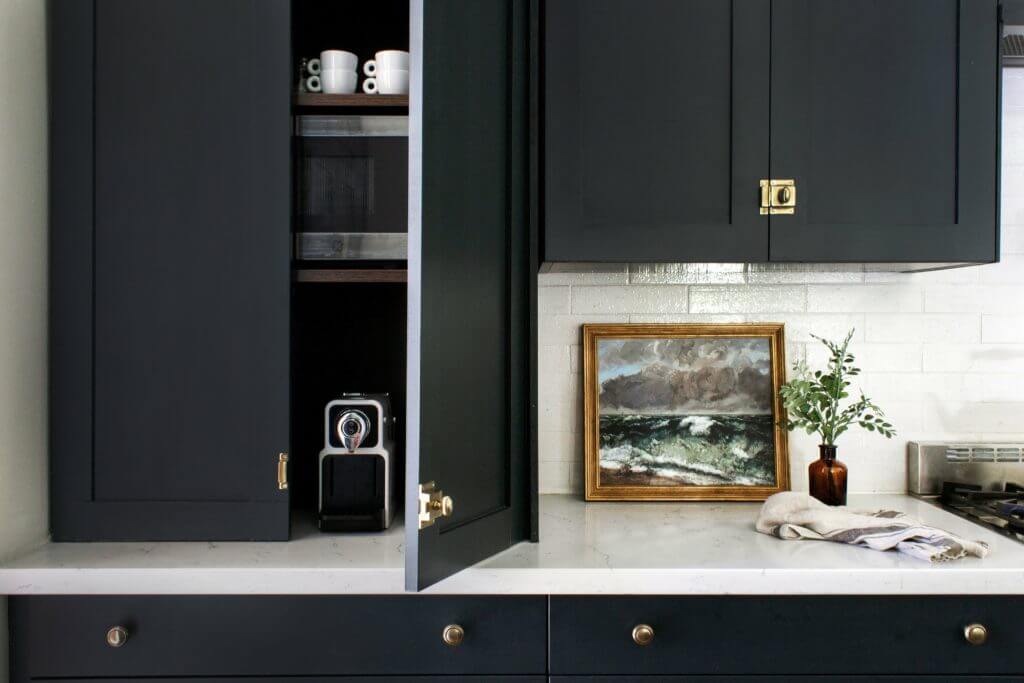
One of my favorite decisions was incorporating an appliance cabinet & coffee bar into the design. Because this kitchen is open to the living room and is visible from the entryway, we wanted to minimize visual clutter as much as possible. We put the coffee bar off to the side, so anyone can linger over there without getting in the way of traffic flow. During electrical rough-ins (when the electricians come to run wires) we had them add an outlet into the cabinet, so all the chords are contained. We ran the countertop underneath the cabinet, which makes cleaning up inevitable coffee spills much easier. Inside, we have an espresso machine + milk frother, toaster, small microwave, blender, and some mugs. In the base cabinet directly below it, we keep a stash of Nespresso pods & tea in the top drawers and store less used appliances on the bottom shelf.
Taking Advantage of High Ceilings in The Blonde Vic Kitchen
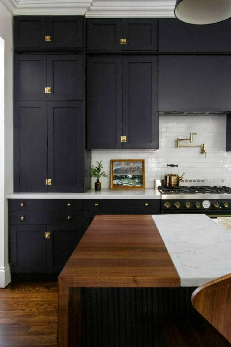
The ceilings in our kitchen are 10′ tall, so we took advantage of that and stacked our upper cabinets. The bottom set are 40″ tall, and the top set are 15″. Bryan built a library ladder rail, which we installed between the top two tiers of cabinets to support our rolling library ladder from CS Hardware. The frame for the rail is made out of select pine, which is smooth & better quality than standard pine, and painted to match the cabinets. (This was a huge advantage of going with the DIY Shaker doors. They may require extra work over the prefinished doors that Semihandmade has, but they give you extra flexibility to customize & paint without having to worry about your added pieces matching the pre-finished doors!)
We store it in our living room corner and will post more photos soon when we finish staining it.
Finding Bargains and Inspiration for The Blonde Vic Kitchen
We saved a few thousand dollars easy by buying all of our appliances scratch & dent. The range, panel-ready dishwasher, and panel-ready fridge totaled about $6k but should have cost over $10k. The best part is that none of them were actually damaged — they were just floor models, which means they were out on display but never actually used (these are often the best type of scratch & dent finds).

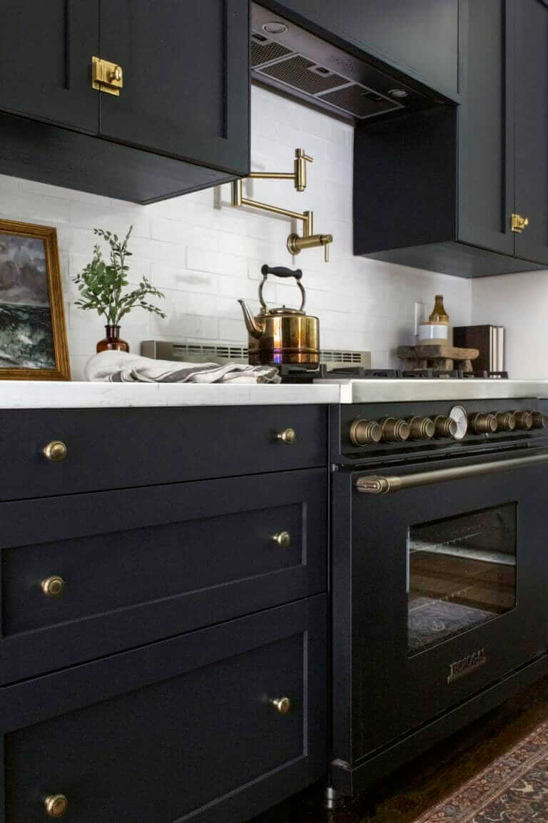
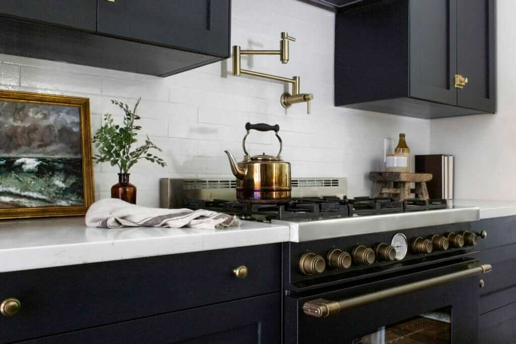
Our range was the inspiration for the entire kitchen, and the first purchase we made on our reno (not even kidding). We originally were looking at La Cornue, which are $10k+ alone, and somehow stumbled upon Tecnogas, which is an Italian brand that expanded into the US market a few years ago. There are no LED controls – everything is controlled with the knobs – so it feels old timey & fits right in with the rest of the home. Favorite features, aside from it working really well & being easy to use, are the soft close door (why don’t all ranges have this?), the dial on the front displaying how hot the oven is, and the black-stainless-brass combo.
Choosing the Right Hardware and Countertops for The Blonde Vic Kitchen
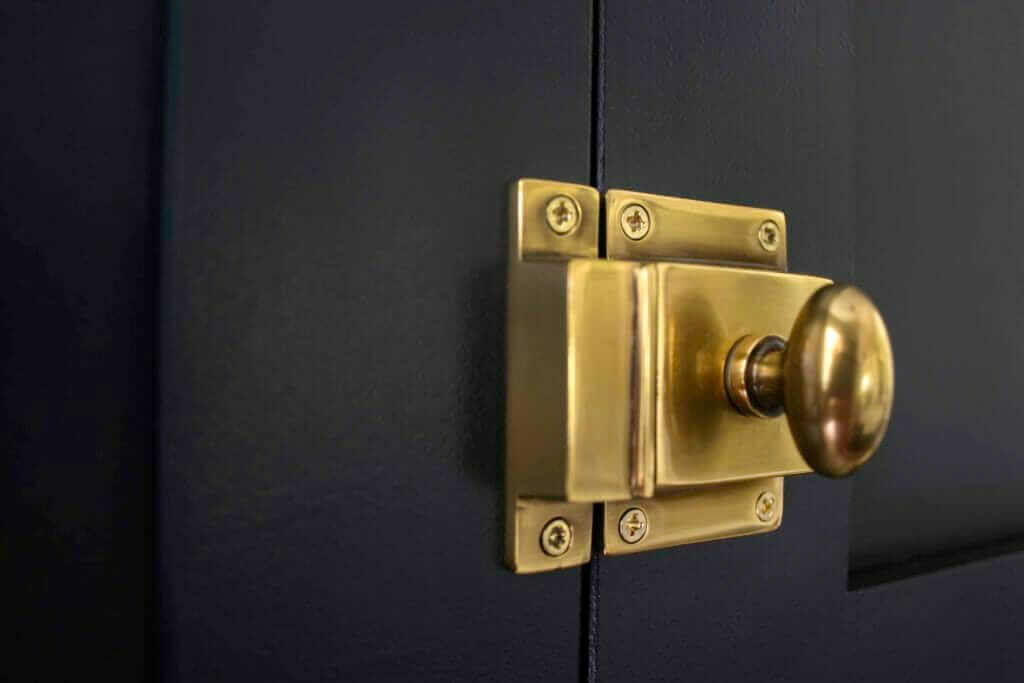
From the beginning, I knew I wanted to use latches on the cabinet doors. We searched for a few weeks for the perfect ones and ended up discovering Emtek. Guys, their hardware is SOLID. We chose 5 different pieces of hardware for this space (two different types of knobs, latches for the uppers, appliance pulls, and cup pulls for the dishwasher and pull out trash bin), but kept the finish French Antique throughout.
For countertops, we chose quartz for the range wall and marble for the island. We liked the idea of going with Quartz next to the range because it’s virtually maintenance free and can handle spaghetti sauce splatter and oil spills like a champ. Because it’s on the back wall, you can’t really see the details of it either way and figured we’d save ourselves a few headaches by having something super low maintenance next to the range. We bought the Cloud River slab from Floor & Decor and installed it ourselves to save money.
On the island, we found a discounted Carrara marble slab at a local stone yard and fell in love. There was only one slab available, and that slab was only long enough to cover one waterfall edge + about 3/4 of the top of the island. After scouring the internet for ideas, we stumbled upon this kitchen by Jean Stoffer and had an ah-ha moment. We worked with Josh from A Carpenter’s Sonhere in Columbus to build a walnut waterfall edge to complete the island, and IT’S PERFECT. We weren’t sure how durable the wood would be and have been pleasantly surprised at how well it’s held up.
Conclusion and Future Plans for The Blonde Vic Kitchen
Here’s one last peak at the space.
Kinda hard to believe it used to look like this!
And that’s all for now, folks. We’re working on a full budget breakdown of this space with all of our sources linked up, and can’t wait to share more photos of our library ladder. We’ll be back soon with more! In the meantime, be sure to follow us over on IG @beginninginthemiddle.
xo,
C & B
You Might Also Like:
Fireclay Farmhouse Kitchen Sink Step-By-Step Installation
Budget-Friendly Bathroom Remodel
If you have any additional questions during your search for the perfect copper, fireclay farmhouse sink or crafted stainless steel sink, our Sinkologists™ are here to help. Contact us or follow us on Facebook, Houzz, Pinterest, Instagram, or TikTok for more helpful tips and design ideas.